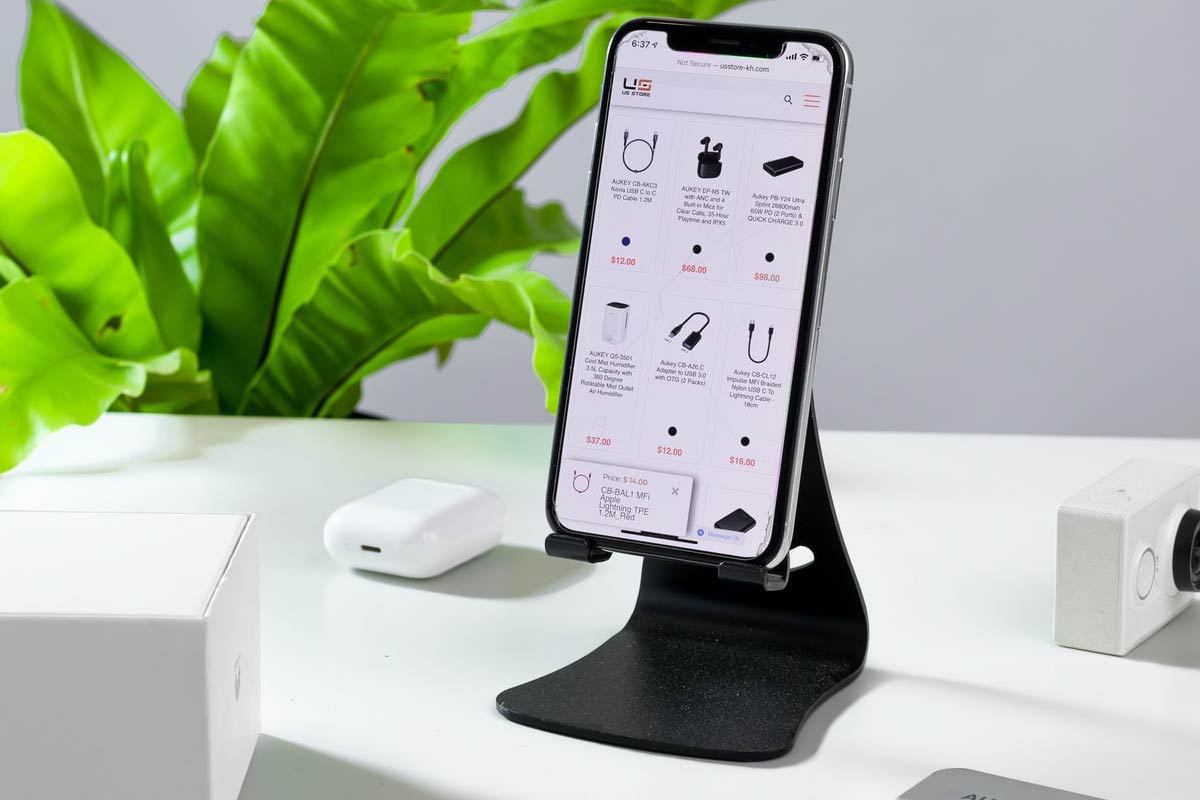
Mobile-First Indexing Plays A Great Role When It Comes To Technical Optimization
To enhance site performance, one of the best technical SEO strategies used by marketers is to optimize mobile performance. Mobile-first indexing refers to Google primarily using the mobile version of the content for indexing and ranking. Historically, the index mainly considered the desktop version of a page’s content to evaluate its relevance to a user’s search query. But now because the use of mobile devices is becoming more and more significant among prospective customers to search for products and services online, Google gives more importance to mobile-friendly websites.
Best Practices for Mobile-First Indexing:
1. Implement Responsive Web Design
With a responsive web design, one doesn’t have to create multiple versions of the website to suit different devices. It allows website visitors to see an optimized version of the site on any device such as on a phone, tablet or desktop having varied screen sizes.
If your aim is to create a consistent user experience across all devices and improve your rankings on the Google SERP, then having a responsive web design is crucial. Don’t forget, Google and most of your potential customers loves mobile-first design and so should you!
2. Make Sure Googlebot Can Access And Render Your Content
It is important to ensure that Googlebot, which is Google’s web crawler software, can access and render your content on the mobile version of your website too. For this to be possible, you need to adopt the three following steps:
-Use the same meta robots tags on your mobile and desktop site
If you use different meta robots tags on the mobile version as compared to the ones on the desktop site, Google may fail to crawl and index your page when your site is enabled for mobile-first indexing.
-Don’t lazy-load primary content upon user interaction
Googlebot will refuse to load content that needs user interactions such as swiping, clicking, or typing to load. So it is vital to keep in mind that the lazy-loaded content is implemented correctly so that Google can crawl and index it, otherwise, it might remain hidden from Google.
-Allow Googlebot to crawl your site’s resources
If some resources on your mobile version have different URLs than your desktop site, you should ensure that you are not blocking them with a disallow directive. Disallowing a page means you are asking Google not to crawl it and thus, you should know what you are blocking since this might affect the ranking of your pages on the SERP.
3. Use Identical Content Across Different Devices
Your mobile site should include the same content as the one on your desktop site. If currently, your mobile site has less or different content, consider updating it since nearly all indexing on your site comes from the mobile version.
4. Analyze Your Structured Data
Your structured data should be available on both your mobile and desktop versions of the pages. This is pivotal since with mobile-first indexing, Google will only use the mobile version of your page for indexing, and will otherwise miss the structured data. Ensure that URLs within the structured data of your mobile site are updated to the correct mobile URL equivalents. You can use Data Highlighter which is a user-friendly tool that helps to mark up structured data on your website without the need to implement any code.
5. Verify Your Ad Placements
If your ads are not placed correctly, they can harm your mobile page ranking and thus, you must be careful about it. For instance, if the ad is placed at the top of the page, it can take up too much space on a mobile device, leading to negative user experience. One can follow Better Ads Standards to make sure that the ad placements meet the set criteria.
6. Check Your Visual Content
The images on your mobile site should align with the following image best practices:
-Use high-resolution images and ensure that they do not look too small when viewed on smaller screens.
-Use supported format and tags for images.
-Avoid using URLs that change each time the page loads for images since Google will not be able to process and index your resources correctly.
-The alt text for images should be identical on desktop and mobile sites.
7. Check Your videos
The videos on your mobile site should align with the following video best practices:
-Avoid using URLs that change each time the page loads for your videos as Google will not be able to process and index your resources properly.
-Use a supported format for your videos and add videos in supported tags. Videos are identified in the page by the presence of an HTML tag, for example: <video>, <embed>, or <object>.
-The same video structured data should be used on both your mobile site and desktop site.
-The video must be placed in an easy-to-find position on the mobile version of the page. For instance, the user should not have to scroll down too much to find the video since it might harm its ranking.
Read more: 7 quick ways to decrease your page load time and enhance your technical SEO


